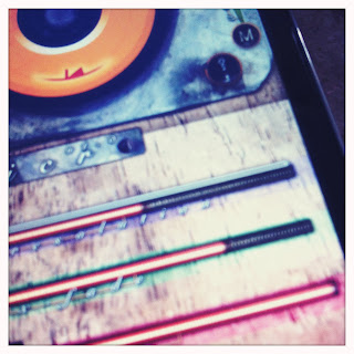
Ha! While my personal favor actually went to minimalistic graphic design, it seems that overall live musicians preferred the skeuomorphic design, and that for a good reason.. A weird kind of psychological remembrance to all those real-world instruments and boxes we have so much fun making sound and music with. These real objects whose shapes and structure vibrate the sound up to our ears. And I even got fond of that weird looking machine myself, looking forwards to jam with it as I would with any of my favorite vintage instruments or effects.
 |
| teaser? will you get to know these in a future Loopr? |
There is also another pretty good reason: while it would definitely be easier, and faster, for us to develop simple geometric interfaces to control Loopr, working on the user interface as if we were actually working with wood, metal, nuts and bolts, made us think deeper into the subtler details of ergonomy and design, as if it were indeed harder to undo any specific design change in a real-world object, thus necessary not to screw up the functional design. That's why we currently build many iterations of simplified models, test them, and then refine them according to the features we want. Only when field-satisfied, will that UI find a way into our public release.
So, while we're still not delivering our updates as fast as we want, hopefully you'll understand better what's cooking for so long on our stove, and why the wait might be interesting. ;)
No comments:
Post a Comment